We will design a successful
E-commerce website for you
eCommerce website design
Things to keep in mind when designing a web store

E-commerce website design: introduction
Online shopping has long stopped being considered an exotic thing. The first online sale through a secure website interface (the foreshadow of all today’s online stores) happened way back in 1994. This paved the way for explosive growth of a new world trade concept—e-commerce. A mere couple of decades later, the online sales market has turned into a gigantic industry, which keeps on growing fast even today.
The statistics say that, over the past year, approximately 1.8 billion people purchased something online. At the same time, the total volume of sales made up about 3.5 trillion dollars. It is predicted that online shopping will at least double over the next five years. It goes without saying that experts view e-commerce as the future of global trade.
So why is it that some e-commerce websites are very successful and have high conversion rates, while others have to get by on infrequent sales? What is it—mere luck, accident, or is there some underlying pattern to it? Below, we will take a look at a few concept features of a successful web store, plus we will also list a set of key factors that must be considered if you want to build an efficient framework for developing an online business.
Choosing the best platform for your e-commerce
When designing an e-commerce website, start by choosing the platform that suits your goals and resources the best. At first it may seem that there is basically no difference on which system your shop will run. This, however, is far from truth.
We advise our clients to choose one of the two globally most popular e-commerce platforms of the recent years — WordPress (in a bundle with с WooCommerce) or WooCommerce. Without going technical, here is a simple analogy of the difference: compare two trucks, one is a pickup truck and the other is a semi. Say you need to carry small loads around the city. Which car will you choose? Obviously, the pickup truck is much more suitable for the task, plus it is much cheaper to buy and maintain. In this analogy, WordPress is the pickup truck and WooCommerce is the semi.
Based on our experience, in nine cases out of ten, the best platform for all things e-commerce is WordPress. WordPress и WooCommerce are practically identical in their functionality, though the design and running costs are times higher in WooCommerce than in WordPress. E-commerce platform WooCommerce is recommended for use in case the online store hosts a large selection of products—starting from 50,000 and more item names. WordPress is ideal for a smaller selection, and its maintenance will be as cheap as possible. In any case, only direct communication with the client will allow us to precisely define what system will be perfect for your online store.
E-commerce website design: WordPress + WooCommerce
Specifics of E-commerce Website Design
Everybody knows that usual websites and online shopping sites look differently. But what exactly is the difference? Below, we look at the most striking features of e-commerce websites. These features are the ones you should pay special attention to when designing a successful online store.
Storefront
The virtual storefront plays the same role as the shop window of a real store—to present the entire selection of products to potential buyers. Depending on the type of the goods that the store has, there can be various types of storefronts. As a rule, e-commerce websites (especially big ones) use several types at once for their start pages and inside pages. This is needed to give a potential buyer a brief but attractive overview of the available stock. A well-organized storefront provides the client with the easiest possible access to desired products and gives a dramatic increase of sales. These are the most popular types of online storefronts:
- Tree catalogue
- Special offers
- Popular products
- New products
- Sorting by brand names
- Recommended products
The tree catalogue allows to see products divided into categories. This will typically be clear hierarchical menu-submenu structure that allows a visitor to easily find the product category they need.
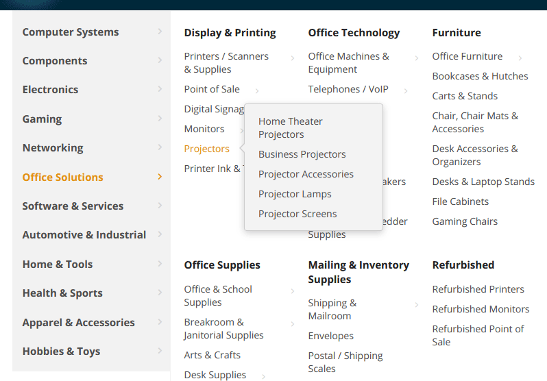
Tree catalogue
Special offers are needed to show all the products that the shop is currently selling with a discount. Unlike in a real store, we will not need to browse the entire website to find out what is on sale. We can see them all in one place in a special storefront, which is very convenient for a potential buyer. Obviously, this kind of page will allow for more sales in your online store.
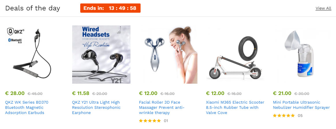
Special offers
In the storefront with the most popular products, you want to show the products that are currently in the highest demand—the sales hits. This can be a seasonal item or something that is in fashion at the moment.
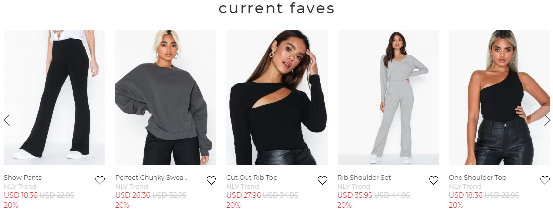
Popular products
New products storefront shows the most recently added items. This storefront can be very convenient for regular visitors of your e-commerce website who have already gotten used to your selection and may be quite interested in new arrivals. Besides that, for example, your buyers can be interested in fresh apparel collections or new models of electronics.
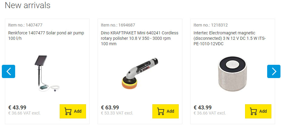
New products
Sorting products by brand names is a very popular type of storefronts in online shops. Often, when we enter an online shop, we know exactly which manufacturer’s product we are looking for. This kind of storefront makes sought products easily accessible for visitors.

Sorting by brand names
The Recommended storefront is often displayed on pages with detailed information about specific products. The store may use a special system of purchase analysis that notices which products are frequently bought together. It then automatically suggests such products as recommended.
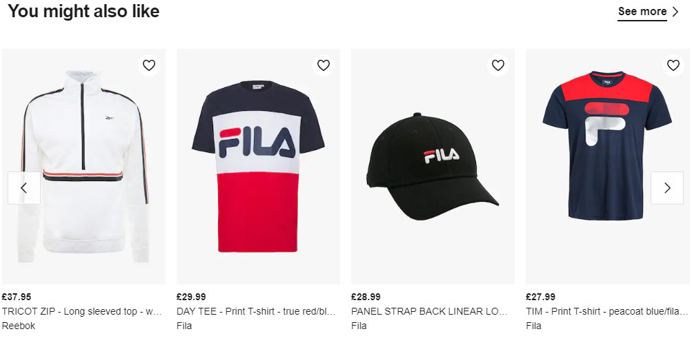
Recommended products
Search
We use online search nearly everyday to find the information we need. Everyone has gotten used to it, it’s fast and convenient. A website search is no exception. We can often make do without the search on a small website (if there is a clear and user-friendly structure of segments), but it will be absolutely essential in a larger online store. Store search is one of the most important elements of user interface. It greatly improves users’ access to the necessary products and increases the conversion.
The search bar must be located in the ‘right’ place, which is typically the top of the screen, and be easily seen. Large e-commerce websites should have their search equipped with the option of category selection. It should, ideally, have the autofill function to suggest variants of search keywords to the visitor. In addition to this, a well-tuned search should return the most relevant results first. If all these recommendations are observed, you can really simplify ordering of the products for the visitor and improve the conversion of your online store.
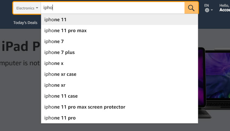
Search
Filters
Many studies have shown that a well-configured filter, just like the search function, improves the web store conversion. Product filtering should help the shop visitor to find the desired product quickly and easily, and also to display your online stock in all its glory. Depending on what kind of products you offer, the filtering parameters can also vary. E-commerce websites often filter by: price, size, color, brand, etc. The filters are typically places on the inner pages of the store catalogue.
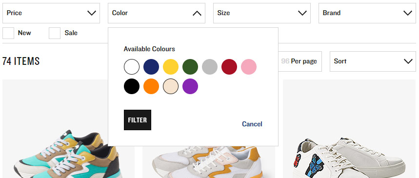
Filters
Product Card
The product card is another one of the most important elements of any e-commerce website. Its appearance is the study subject of many market researchers and UI specialists, which only serves to drive the point of its importance further. So what is it?
The product card is a detailed product description, accompanied by various functional elements. These may be some of the following: the product’s image gallery, its stock status, the “Add to Cart/Buy” buttons, attribute selection (size, color, weight, etc.), the option to compare this item to another, wishlist, “Share” buttons for social networks, the product’s rating, buyers’ feedback, and so on (depending on the type of the product and on the kind of information the shop wants the potential buyers to consider). The positioning of these elements, as well as their size, shape, color—all this significantly affects conversion.
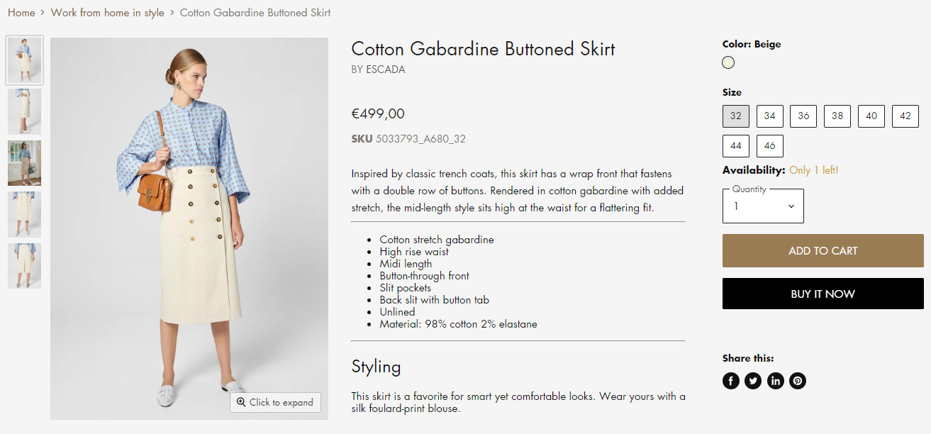
Product Card
Professional Photos
It has been our observation that many web stores do not pay enough attention to this bit. Every one of us, when shopping online, has probably been in a situation when we wanted to take a closer look at the item, to zoom in, to look from different sides—only to see a small, low-quality image, which may even have been the only one available. And sometimes there wasn’t any at all! Obviously one shouldn’t get their hopes high to sell much with this kind of approach. No matter how difficult it could be, an e-commerce website must strive to have all products in their store equipped with high-quality professional photos. Even if the supplier does not provide any, it will be worthwhile to commission a photographer or to make a personal effort. The search engines will definitely appreciate unique and detailed images in your store.
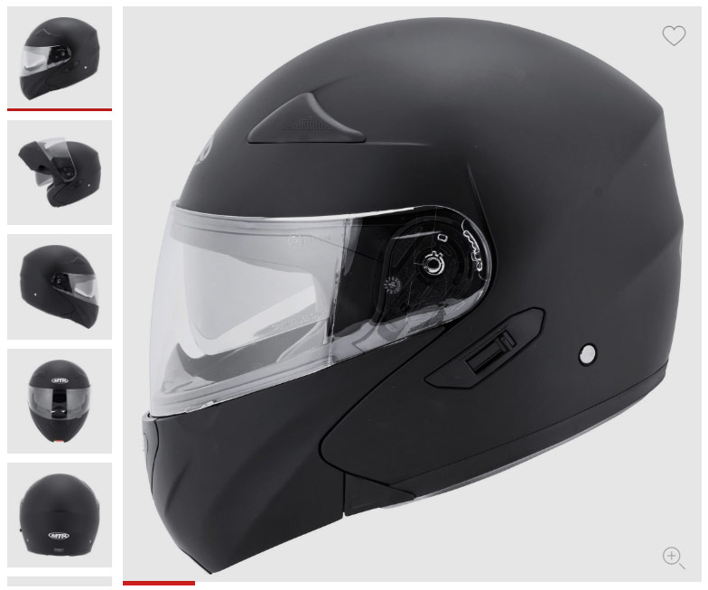
Professional Photos
Payment and Delivery
The last step that awaits every visitors of an online store when making a purchase is the choice of the most suitable options of payment and delivery. But often it is this stage that presents the biggest obstacle in making a purchase. Here are the possible reasons:
- Presence/absence of convenient options of receiving the purchase.
- Cost of delivery.
- Presence/absence of convenient payment options.
One of the crucial concepts of an online store is to help the buyer receive the goods as quickly as possible after wasting as little time as possible. Time and convenience are the main factors behind getting people to use e-commerce sites (naturally, the price is also a factor, but this is beyond the scope of this text). In order for these needs to be met, a web store must offer several delivery options: front porch delivery, via an automated parcel locker, by regular mail, as well as the option to pick up the goods from the offline store or a warehouse.
Whichever is chosen, the delivery must be the fastest and also the cheapest. Few people will want to shop at a web store that has slower delivery than its competitors, at the same price. Adding an option of free delivery (depending on the price of the purchase order) will be a welcome bonus for the buyer.
As for the payment option, being as flexible as possible is the way to go. The shop must be compatible with all local banks and accept all popular international credit cards (Visa, MasterCard, etc.). It is best if your e-commerce runs with e-wallets, such as PayPal. In addition to all this, the customer should have the option of paying through a regular bank transfer.
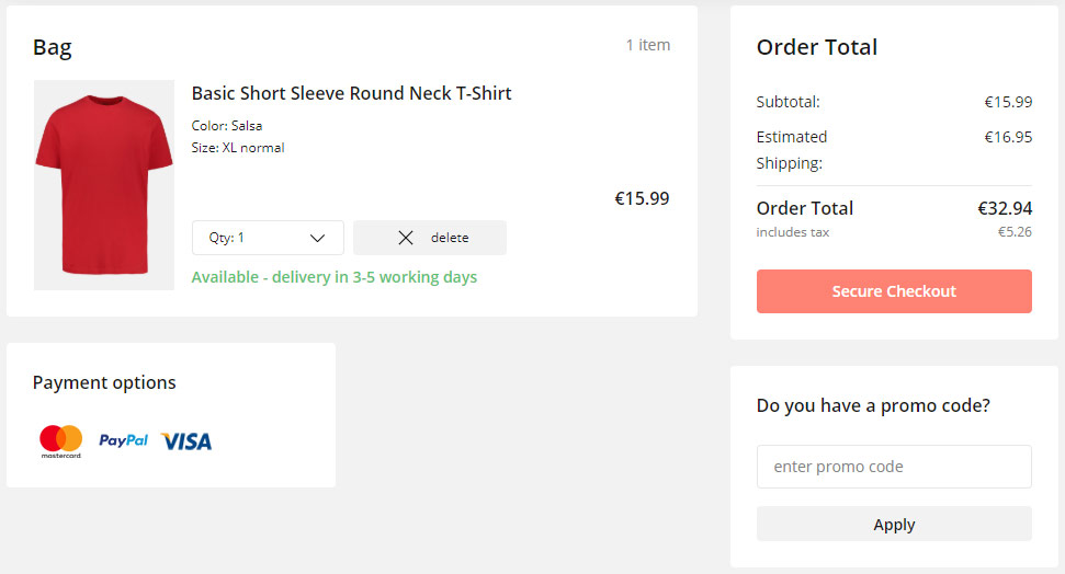
Payment and Delivery
SEO-optimization of E-commerce Website
To sum up, the range of actions for inner SEO-optimization of an e-commerce website is basically identical to those required for optimizing a regular website (read more in «SEO-optimization»). However, a shopping website must pay special attention to optimizing individual product pages, because these comprise the bulk of the whole website.

Ideally, every page comes with a unique title, a short product description and a detailed product description. All these texts must include keywords: the product name plus product-appropriate words from the semantic core of the website. The more detailed the description is, the better. Beside that, the product page must contain the product’s specification, because many people use various features of the product when running a search.
The feedback option and customer rating are the best thing to have available right there on the product page. These features are what search engines hunt for. Every product page in a web shop should include microdata in accordance with the standards of Schema.org. This will make the data structured and organized, aiding search engines in information processing and page content classification.
E-commerce website design: rounding up
All this information is merely the tip of an iceberg in an ocean of information which must be mastered in order to create a successful e-commerce website. We only gave a basic overview of the business.
Our company «Kodulehe tegemine OÜ» designs modern and efficient web stores of any level of complexity. We will design a professional marketing space that will significantly increase your sales or services online. Get it touch with us, and we will help you through this deal to create a successful instrument of e-commerce.